
Common UX Mistakes in Placing Chat on the Interface
Community chats can boost your platform's metrics and engage your users. However, users should have easy and obvious access to these tools. The closer you place a chat to the main content, the more impressive results you'll get.
We've compiled a list of common mistakes in placing entry points and implementing chat features. Avoiding these pitfalls will help you achieve your goals more effectively.
All advice is confirmed by many partners who have launched chats on their platforms.
1. Avoid placing the chat button in the right bottom corner of the page
Users are accustomed to seeing support chat buttons in this location. If you place a community chat button there, users may confuse it with support and attempt to discuss their technical issues there.
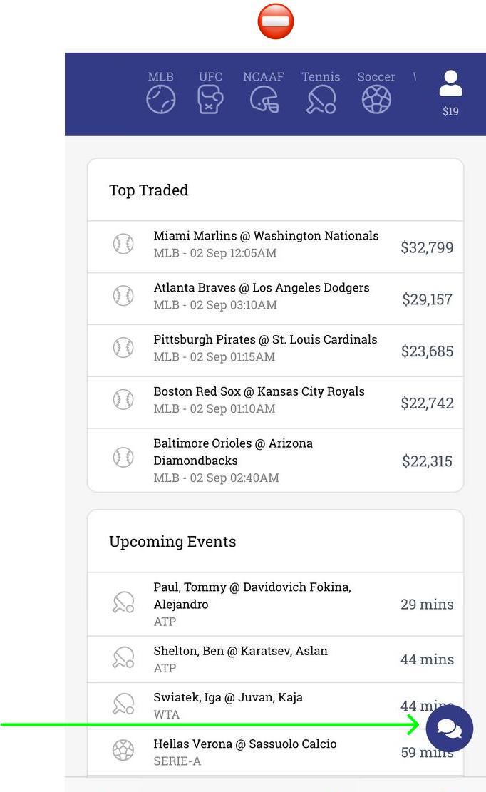
Such a button is usually perceived as one to access support chat.
2. Try not to place the chat button without the name and any additional notification
The first reason this approach is not ideal is the same: users tend to associate chat icons with support chats. We don't need to struggle against habits! Instead, clearly state what users will get if they click the button. This prevents confusion and wrong expectations. The second reason is invisibility. Just another button without a name and description сan go unnoticed on the website or app. If you want community chat to influence your metrics positively, you need to attract as many users as possible.
To make the chat button visible enough, add a notification. It can be displayed to users during their first several sessions after the launch. It's best if the notification includes a call-to-action, like Join the chat and share emotions! or Discuss your games with other players.
Additionally, you can use our Last message widget to engage more users in the chat.
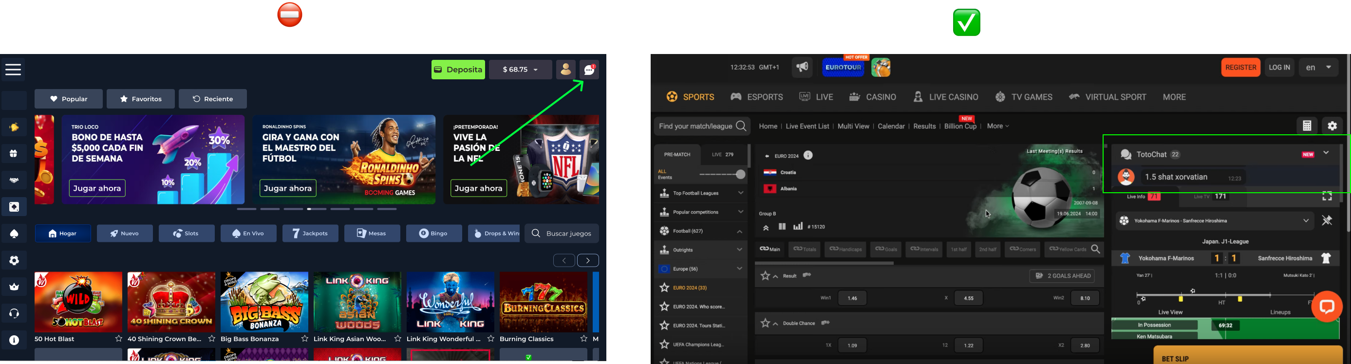
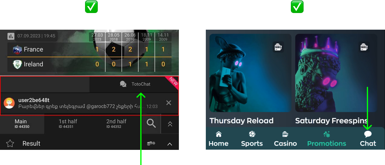
Wrong: An unnoticeable button without a label is placed in the right corner and can be mistaken for the support chat. Right: A chat button has a label and is integrated in a visible place, alongside the latest message widget.
A chat button has a label (at the left) and a notification for new users (at the right).
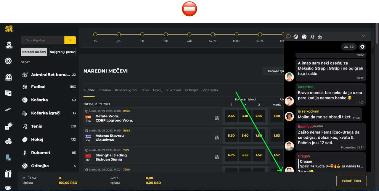
3. Don’t allow crossed elements
A chat can be integrated as an overlay, so make sure that it doesn’t overlap with any elements of your website. This can lead to poor UX on different levels and may also block functions of the chat or the main platform.
A panel below overlays a part of the chat.
A support chat button overlays a community chat.
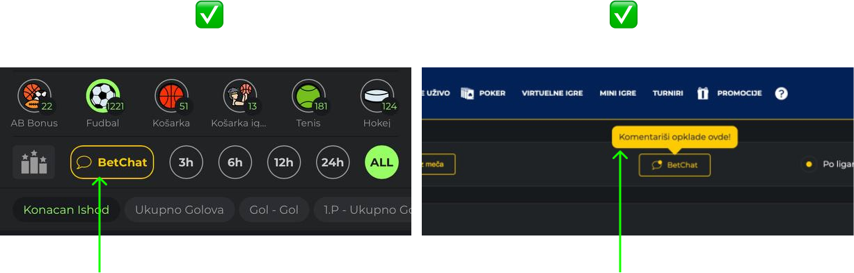
4. Don’t hide a chat under menu sections
If you want your users to discuss content and share their reactions, they need easy access to the chat. If you have events, place the chat where users engage with them. Hiding the chat under internal menu sections will discourage use simply because it isn’t convenient enough. The best way to integrate a chat button as a part of the content page and to make it feel seamless, so users perceive it effortlessly.
On the left, the chat button is a native part of the page; on the right, the chat button is placed in the tab bar and available from all screens within the app. Both approaches work.
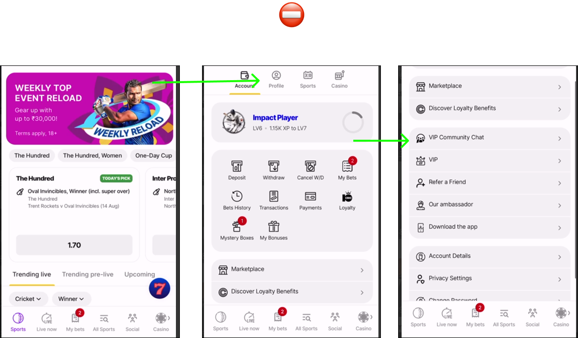
In this case, the chat button is hidden within internal menu sections, making it a long and unclear journey for users.
5: Don't Place Chat Inline Within a Scrollable Page
Embedding the chat iframe in the middle of a scrollable page — between other content blocks — creates a critical
usability issue on mobile devices.
When a user's finger lands on the chat area while scrolling the page, touch events get "trapped" inside the iframe.
The page stops scrolling entirely. The user has to lift their finger, move it outside the chat widget, and try again.
On mobile screens, where the chat can take up most of the screen width, this makes the page nearly unusable.
This affects all touch devices — iOS, Android, tablets, and mobile apps using WebView. The severity varies by platform
and browser engine, but the core problem is the same: an inline iframe with its own scrollable content competes with
the parent page for touch input.
On desktop this issue is less noticeable (mouse wheel events propagate differently), but on any touch-based interface
it's a consistent pain point.
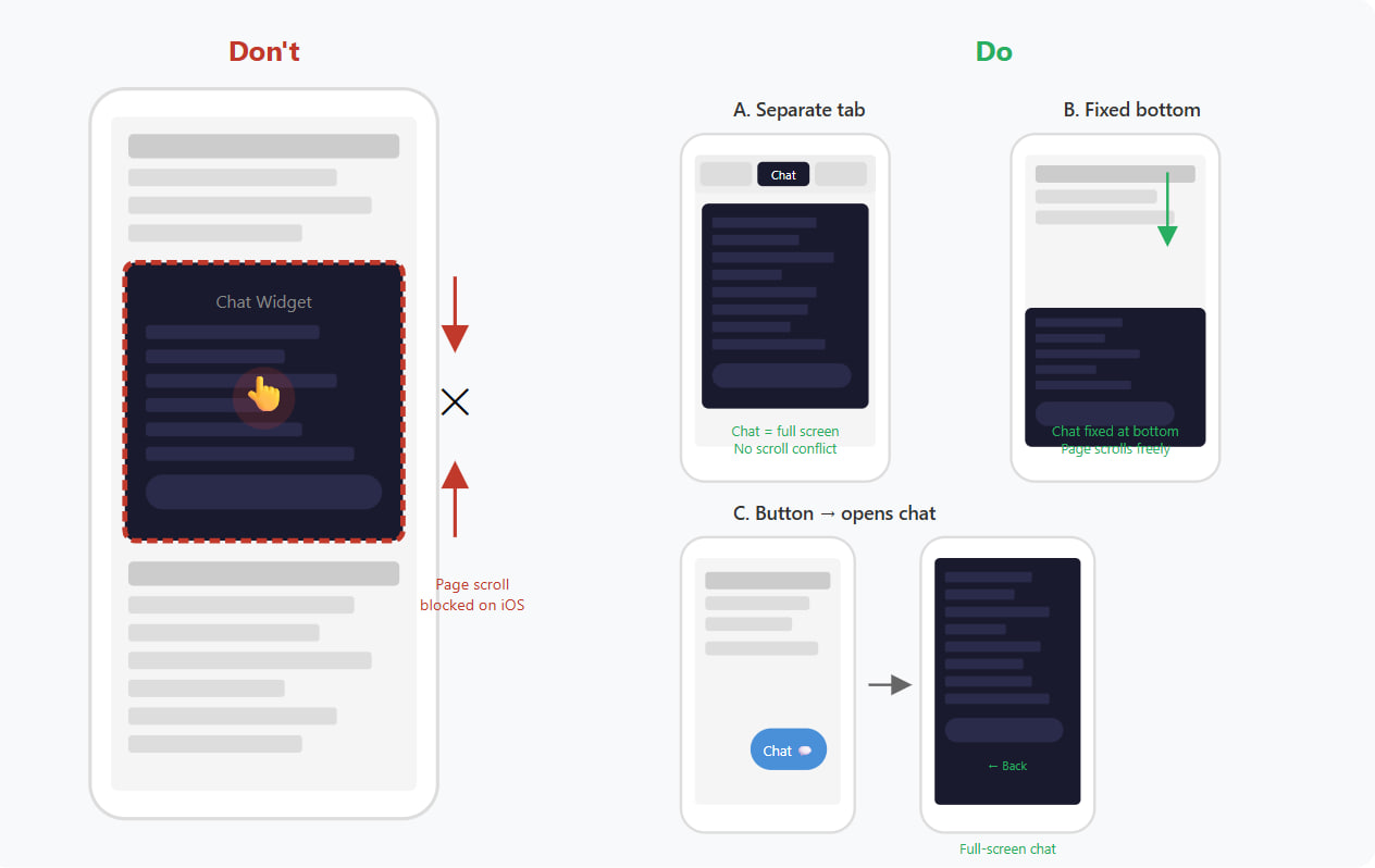
Recommended placement options:
- Separate tab or page — place the chat on its own tab within your page navigation. The chat takes the full available
height, no scroll conflict with other content. This is the most common approach among our partners. - Fixed at the bottom — the chat is pinned to the bottom of the viewport. The main page scrolls freely above it. Works
well when you want chat visible alongside content. - Button → opens chat — a chat button on the content page opens the chat in a full-screen view or overlay. The user
can return to the content page via a back button. Best for mobile-first layouts.
All three options eliminate the scroll trapping issue completely and provide a better user experience across all
platforms and devices.